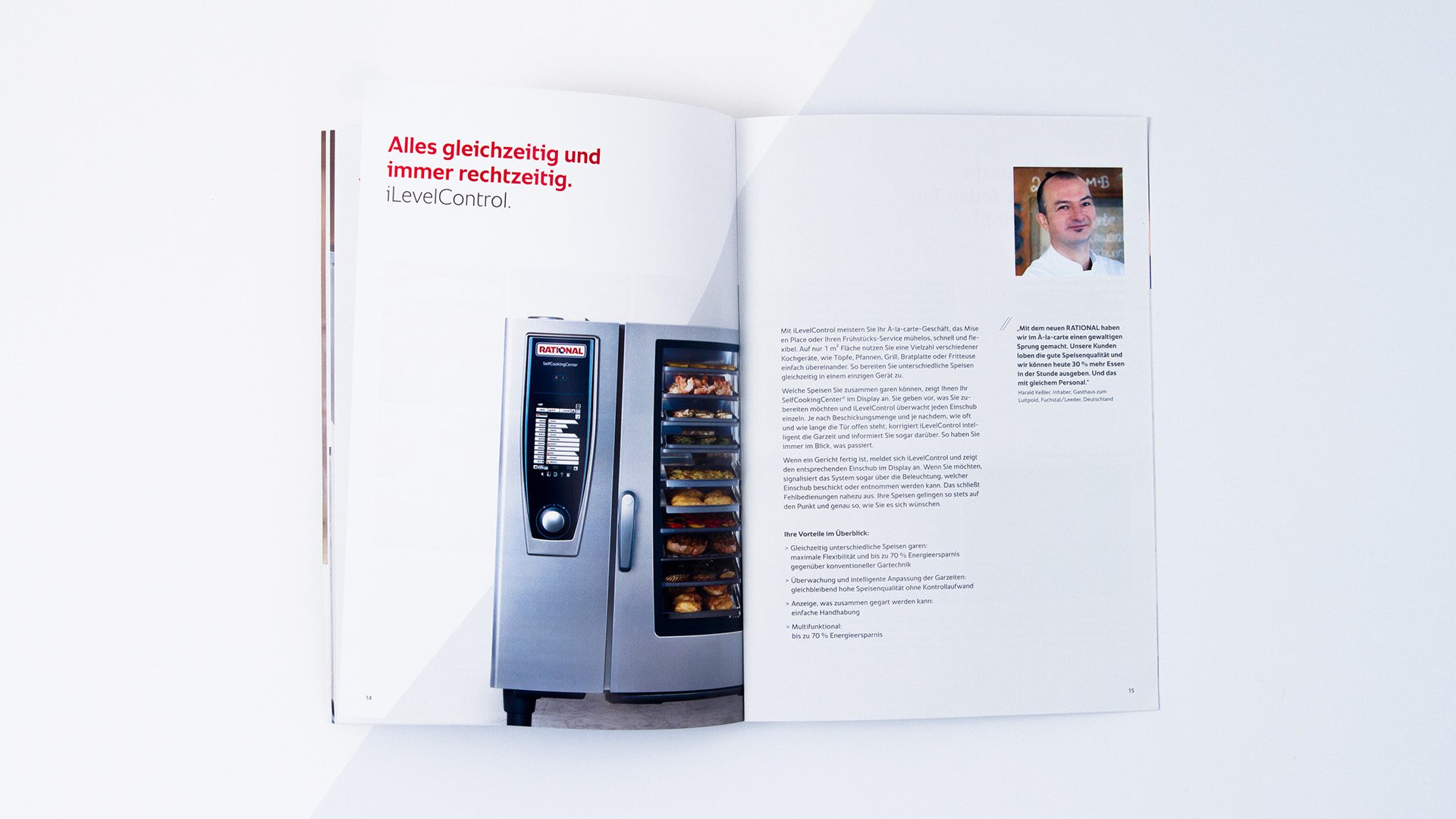
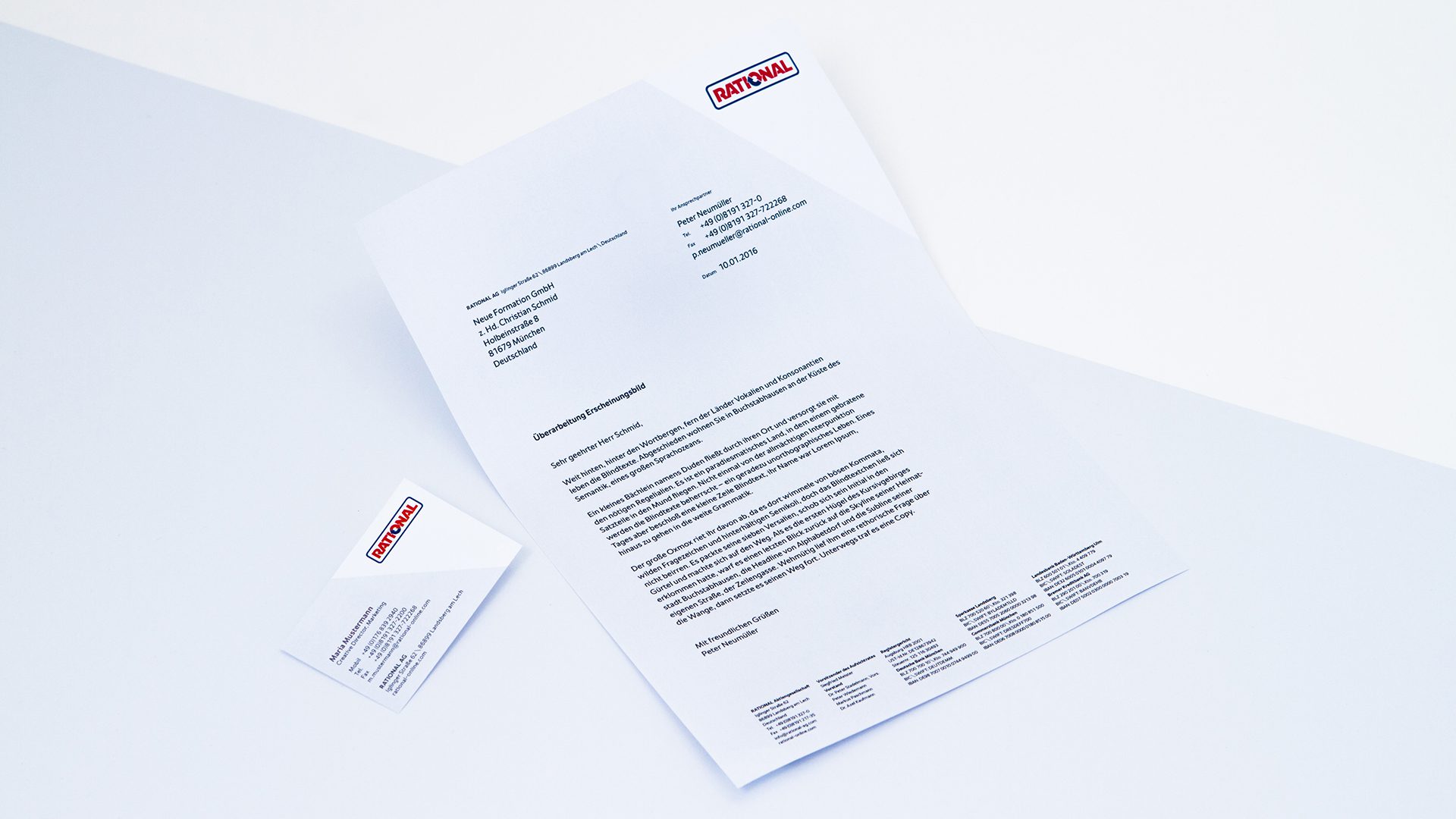
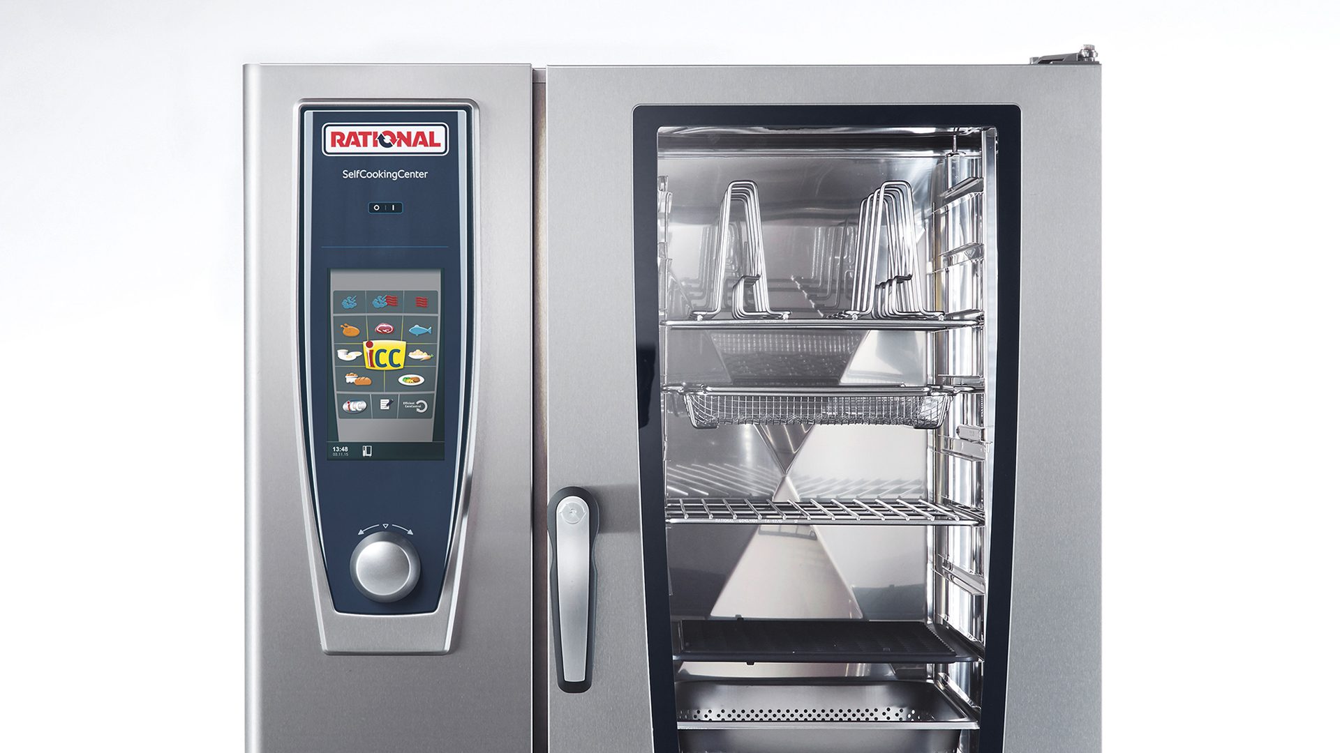
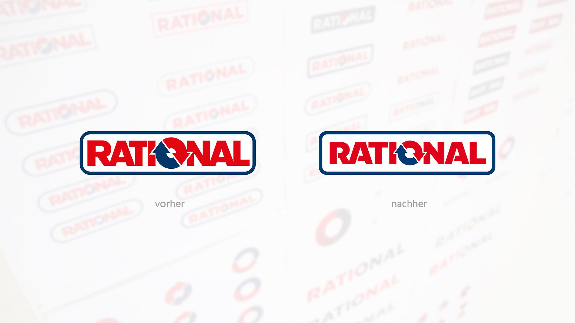
Rational AG is Germany's market leader in cooking systems for the gastronomy sector. The aim was to reflect the Landsberg-based company's technology and innovation leadership in its visual appearance and to achieve a clear differentiation from the competition. For this purpose, we have developed a scalable design system that can be used in both two- and three-dimensional areas and can be adapted internationally.
Redesign
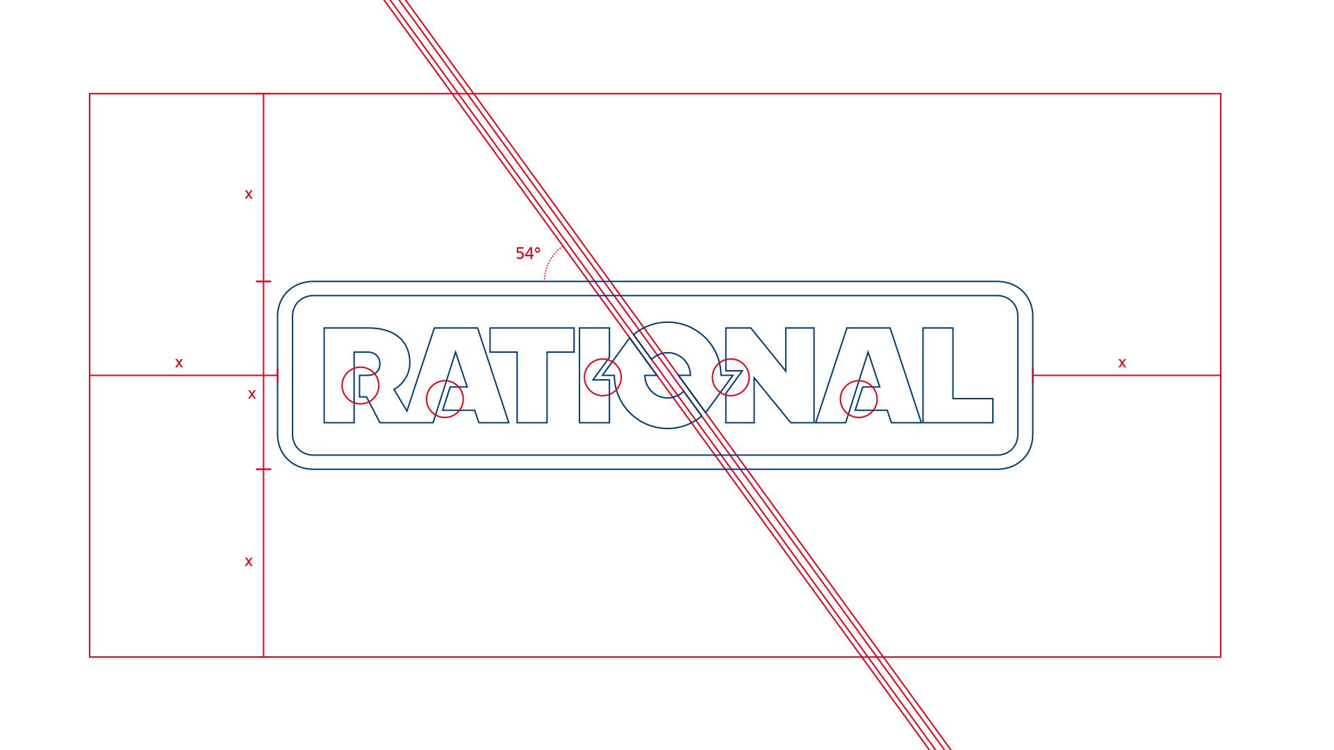
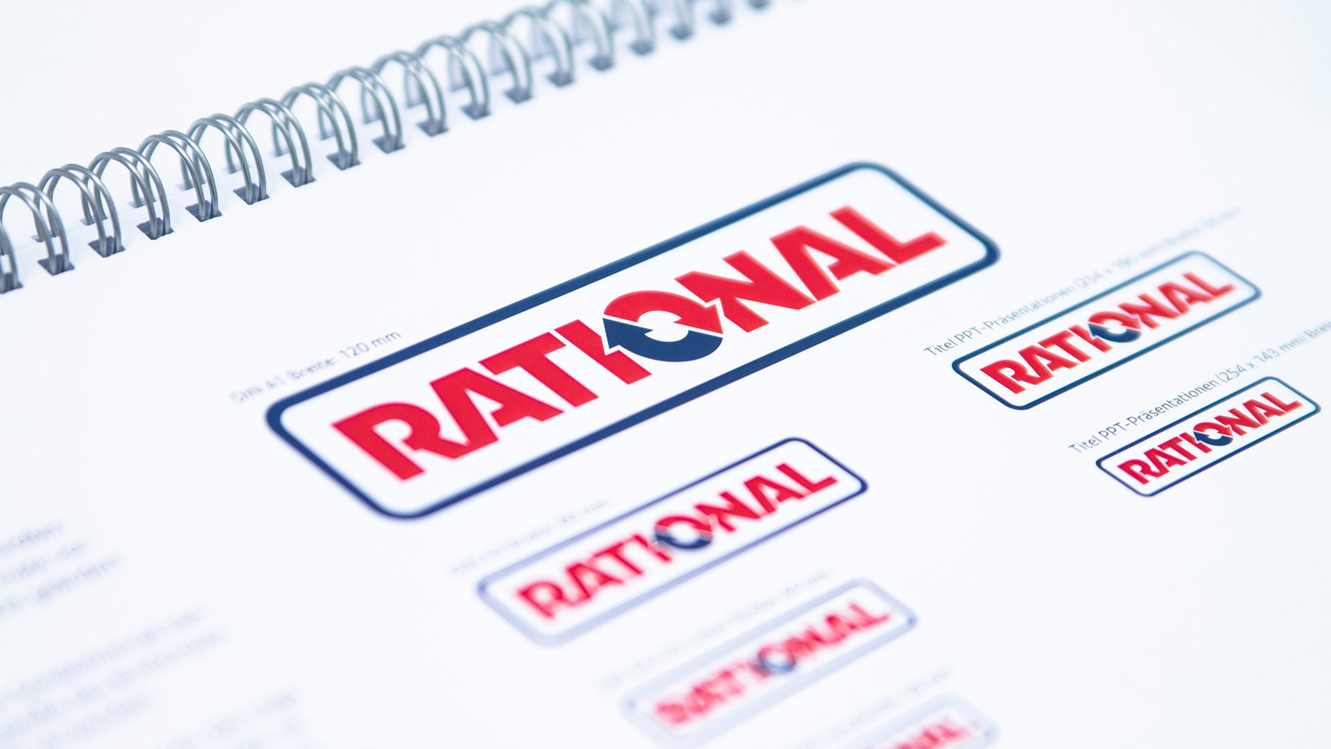
A core element of the new design principle is a basic grid developed from the logo. This originates from the company's traditional core and forms the basis for the visual realignment. At the same time, it acts as an identity-forming element for employees and customers.
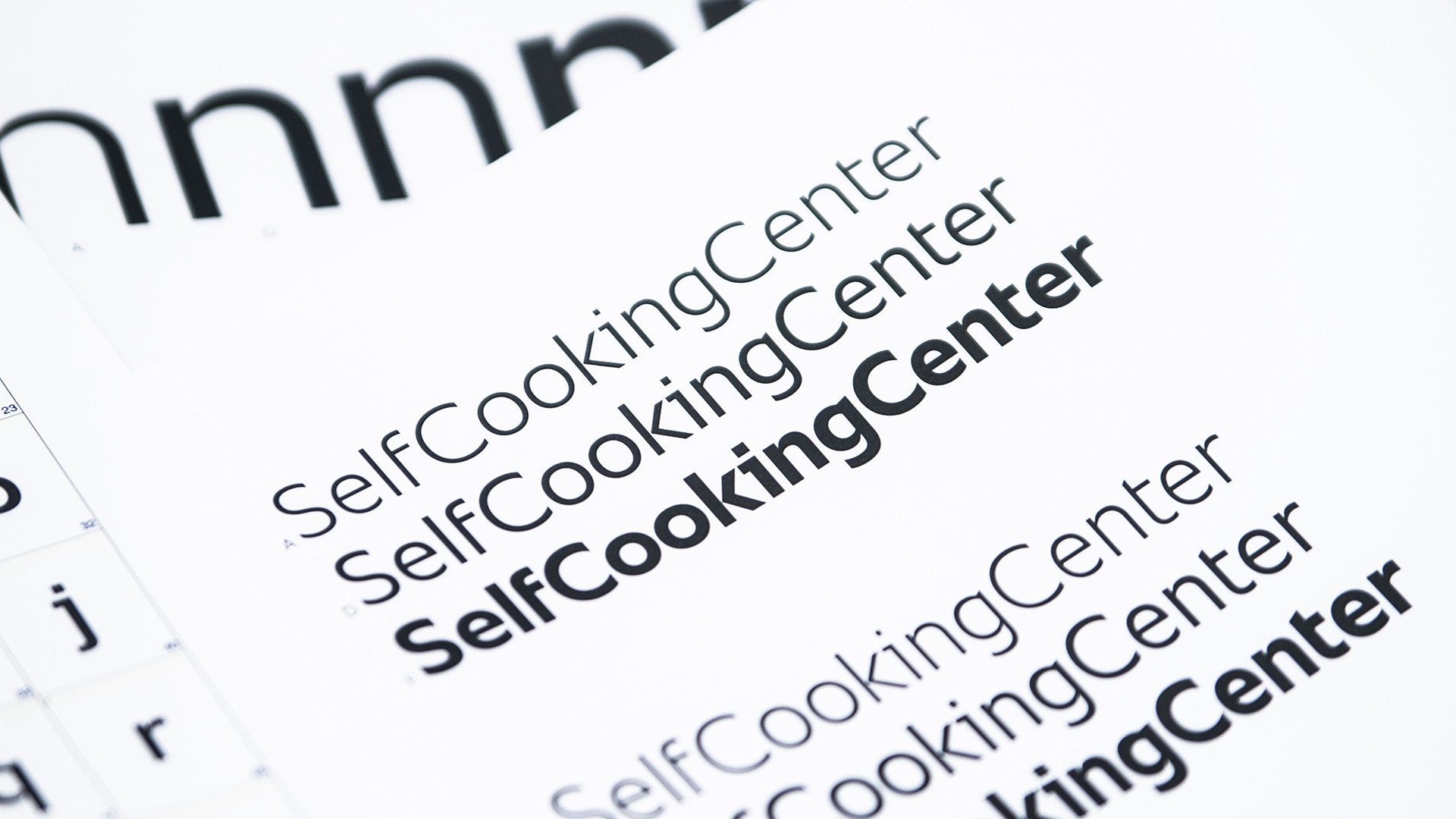
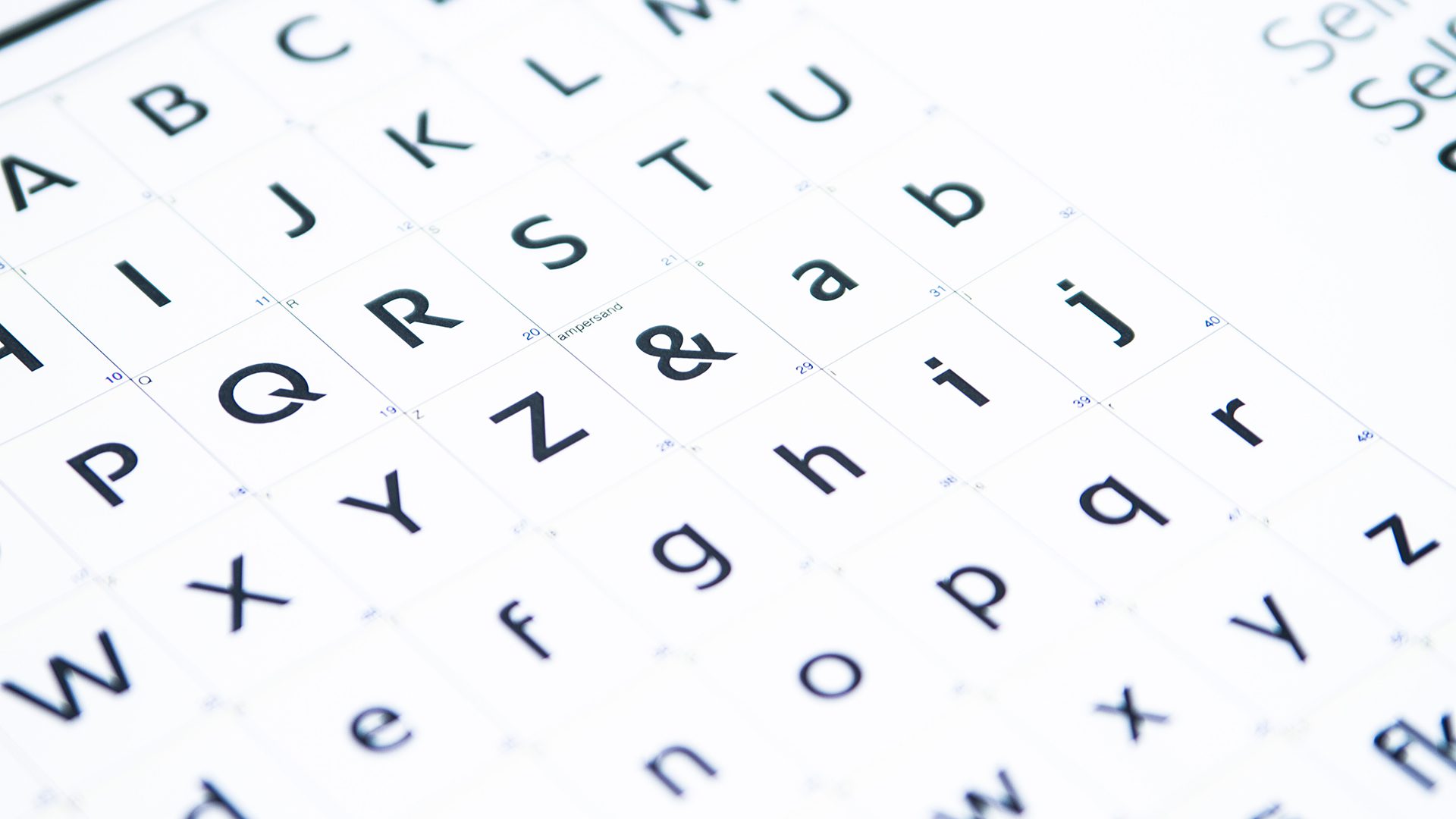
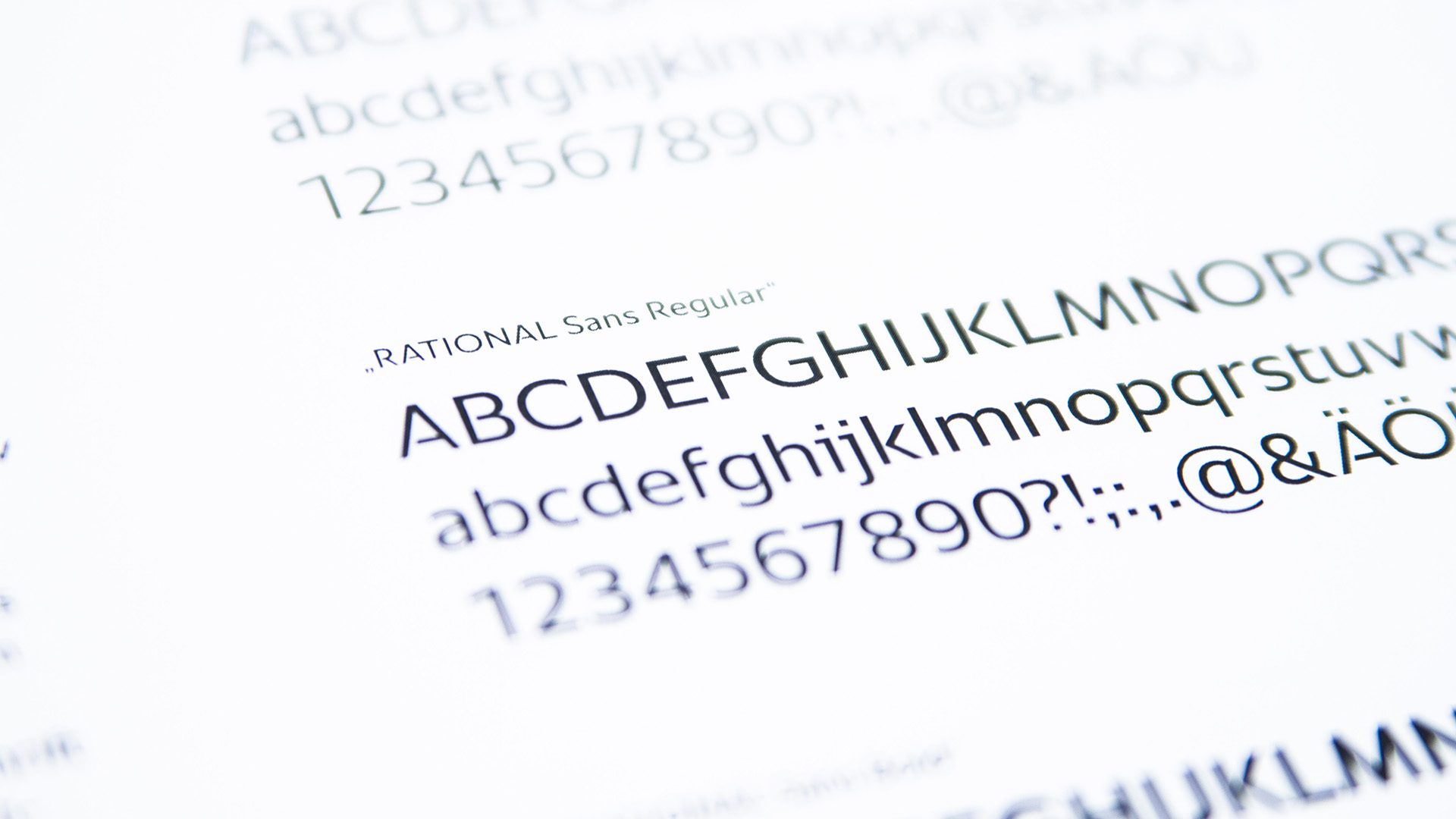
As part of the new brand identity, we also exclusively developed our own font for the company – the Rational Sans. As with the design grid, its characteristics follow the Rational rotor depicted within the logo.