The time has come: the Augsburg State Textile and Industry Museum, or “tim” for short, has a new look – online.
The tim helps us learn from the past and better reflect on current challenges. Overconsumption, globalization, solidarity, business ethics, and the changing world of work were already issues back then.
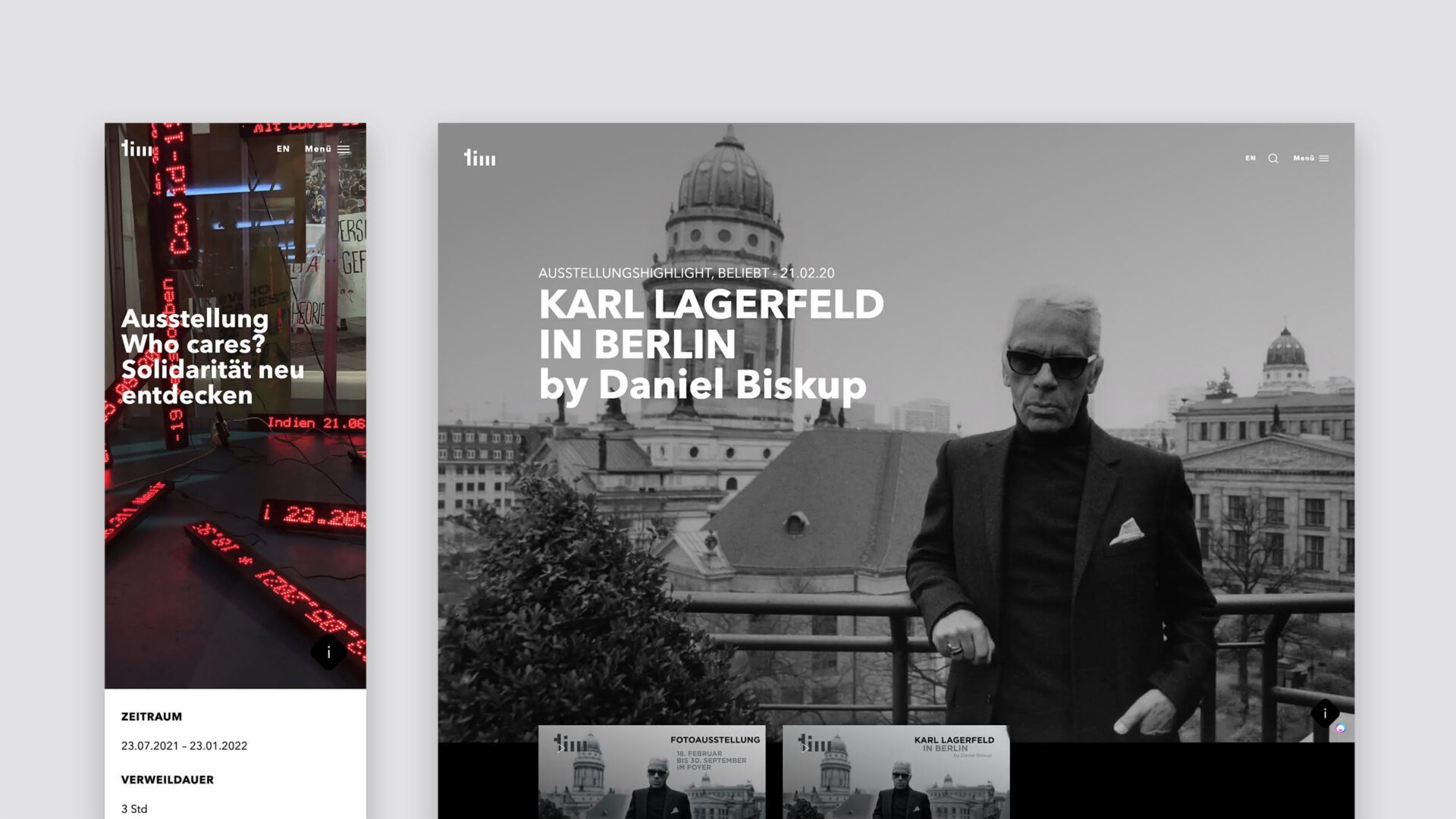
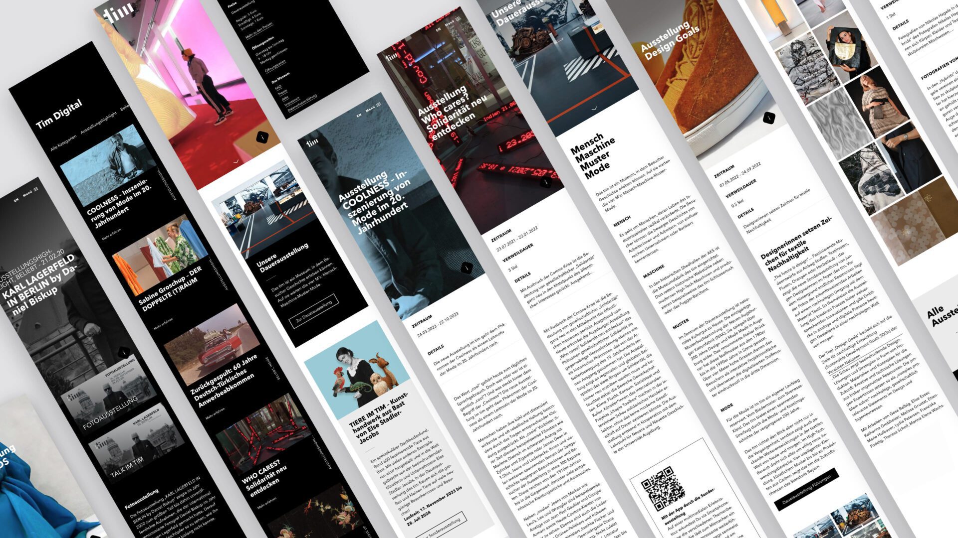
As is expected for a museum, visitors can actively experience this information – on site – and that is exactly what the website should also achieve: to mirror the tim's world of experience online.
This was precisely the challenge and our task: in relaunching the website, we did everything we could to create an incentive online to experience the museum and want to visit it. Live.
It was very important to us to approach this relaunch holistically: functionality, user experience, accessibility, content maintenance, programming, corporate design, search engine optimization and data protection.
Visitors to the website should be drawn into the world of textile history through a clear structure, easy navigation, modern design and the inviting combination of text and moving images.
Of course, programming and finding a suitable CMS played a central role. The decision, taking all requirements into account, was made in favor of WordPress and an individually programmed theme that we developed in-house specifically for the “tim”.
When it comes to data protection, we do without Google Analytics and have also tried to reduce cookies to the bare minimum.
The website was designed, implemented and tested accessibly in-house – an absolutely relevant component for us when implementing digital projects.
In addition, it was important to us to create an environmentally friendly website, i.e. to minimize the loading time and efficiently load large images and videos using modern formats and technology. Climate-neutral hosting is also part of this.
Parallel to the website relaunch, we also designed and programmed a suitable newsletter. So all in all, a well-rounded project.
We modernized the corporate design as part of this website redesign. The color change, which relies on a contrast of black and white, is most evident here. However, accent colors are deliberately avoided. The logo and the corporate font “Avenir Next” were retained as a basis.
We think: it's something to be proud of.
Click here to go to the tim website