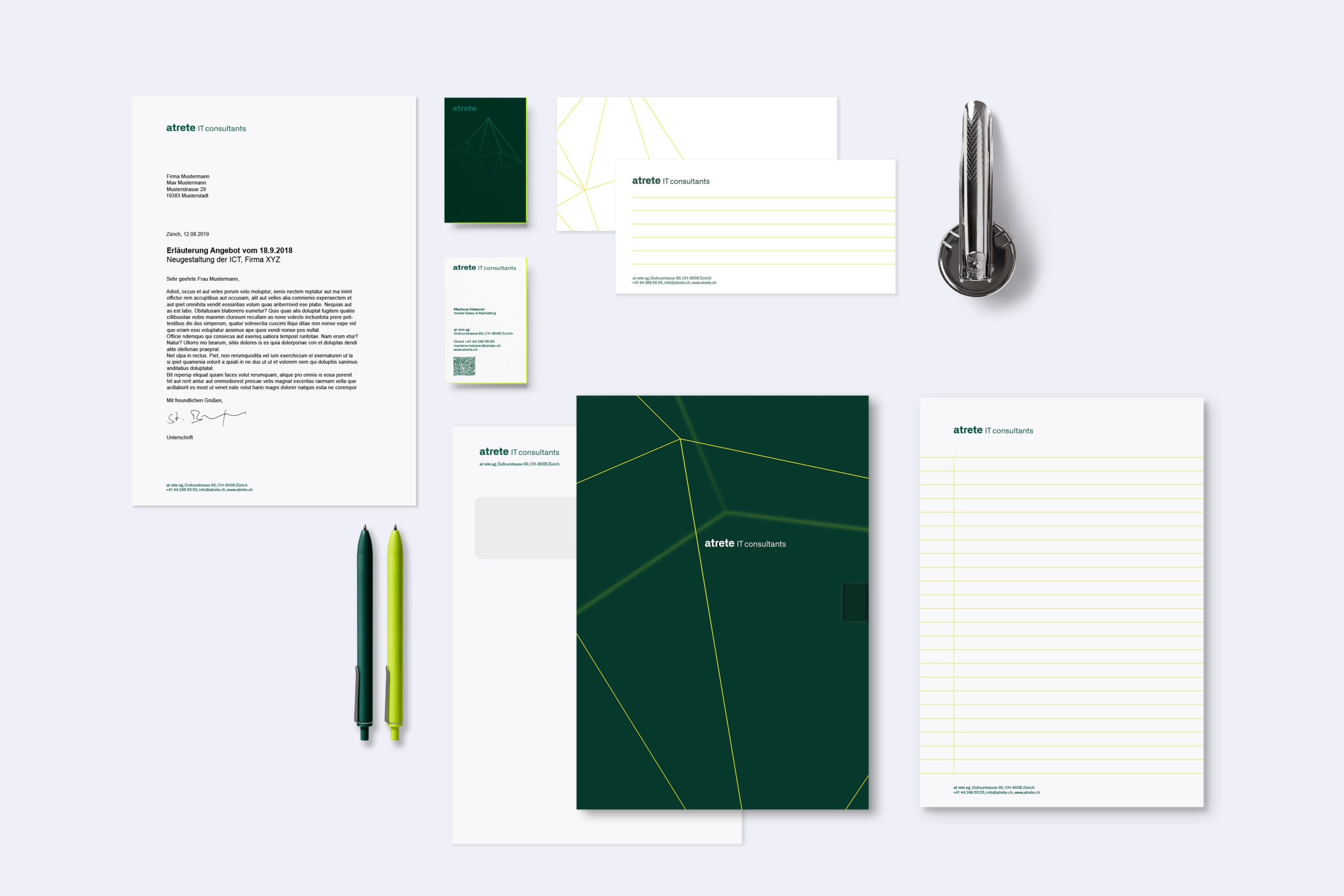
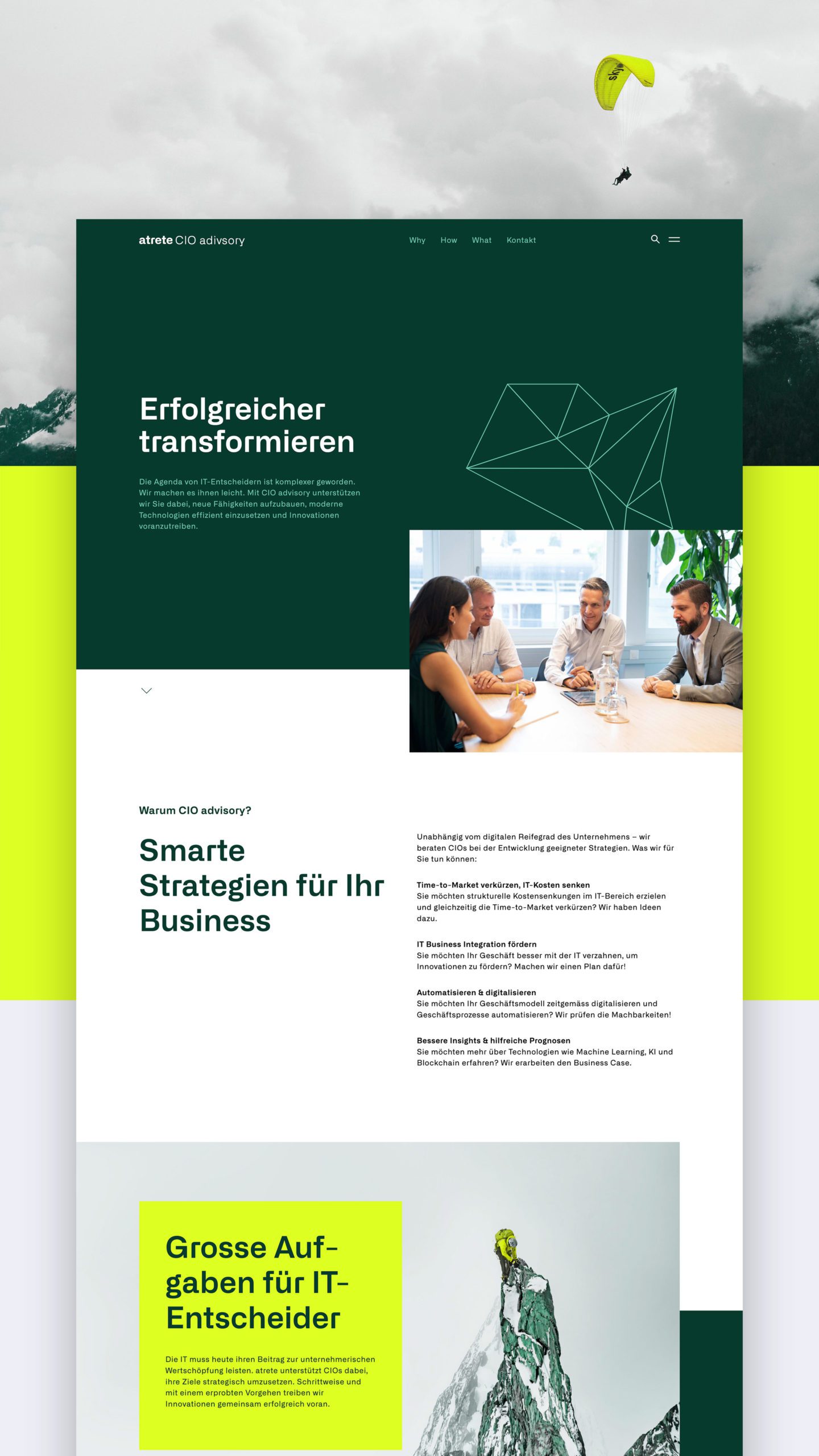
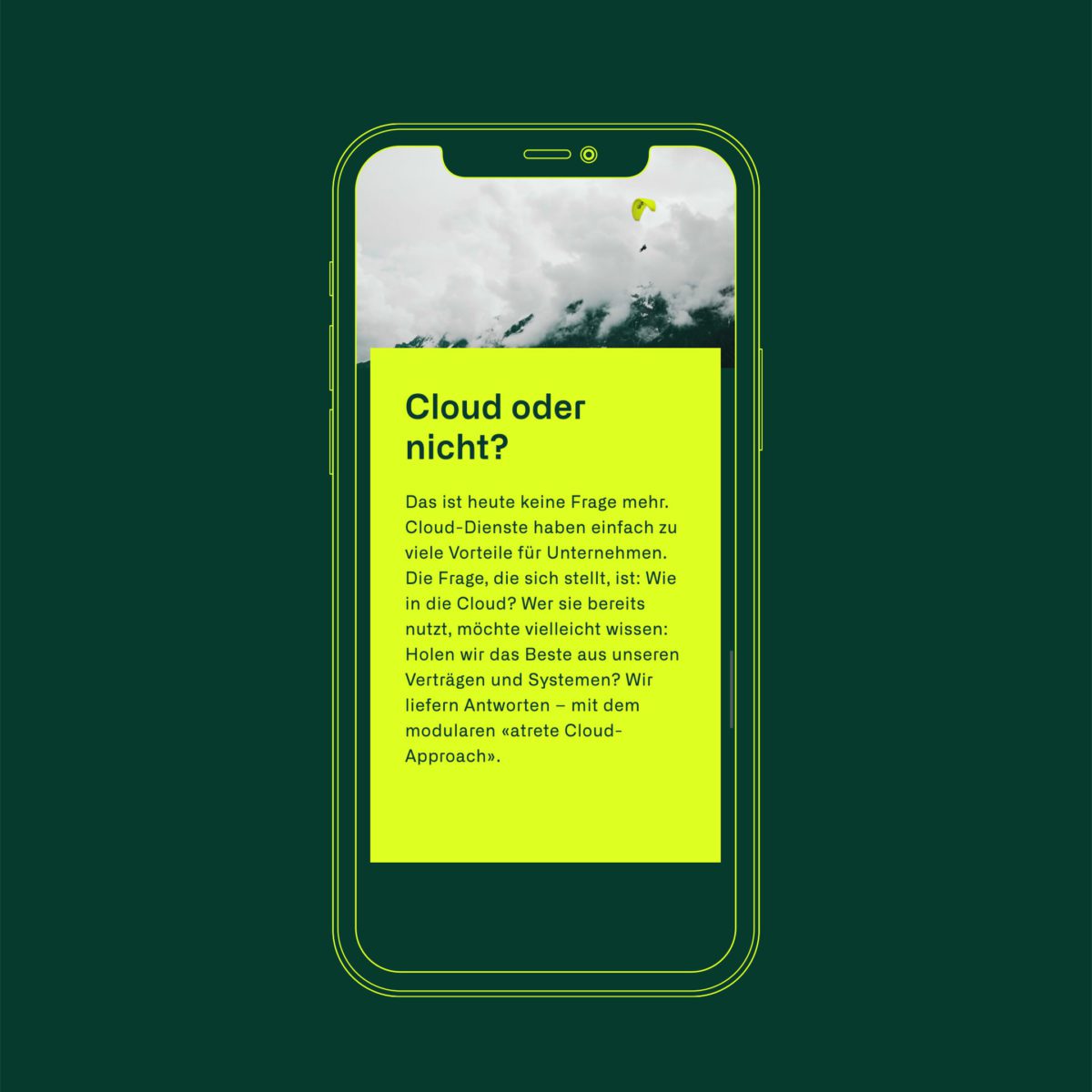
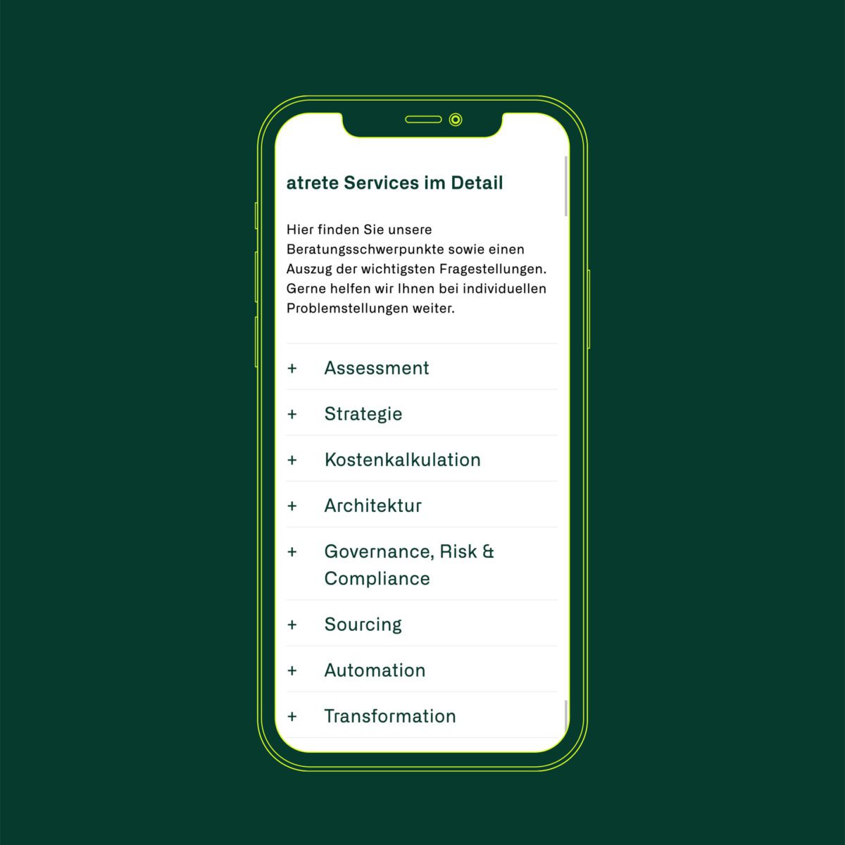
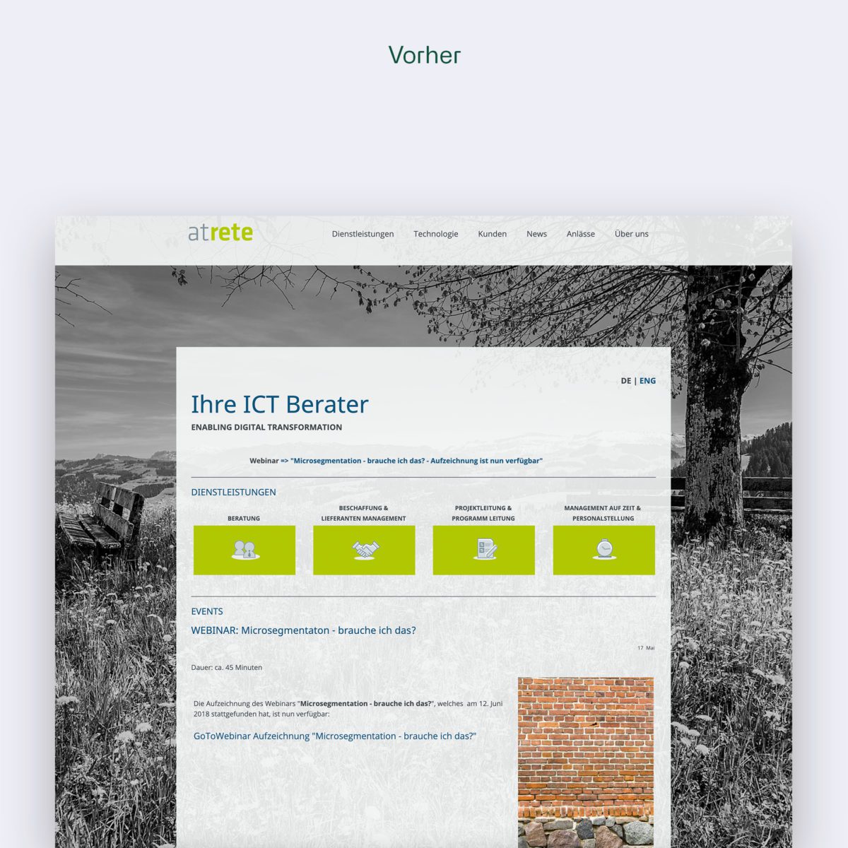
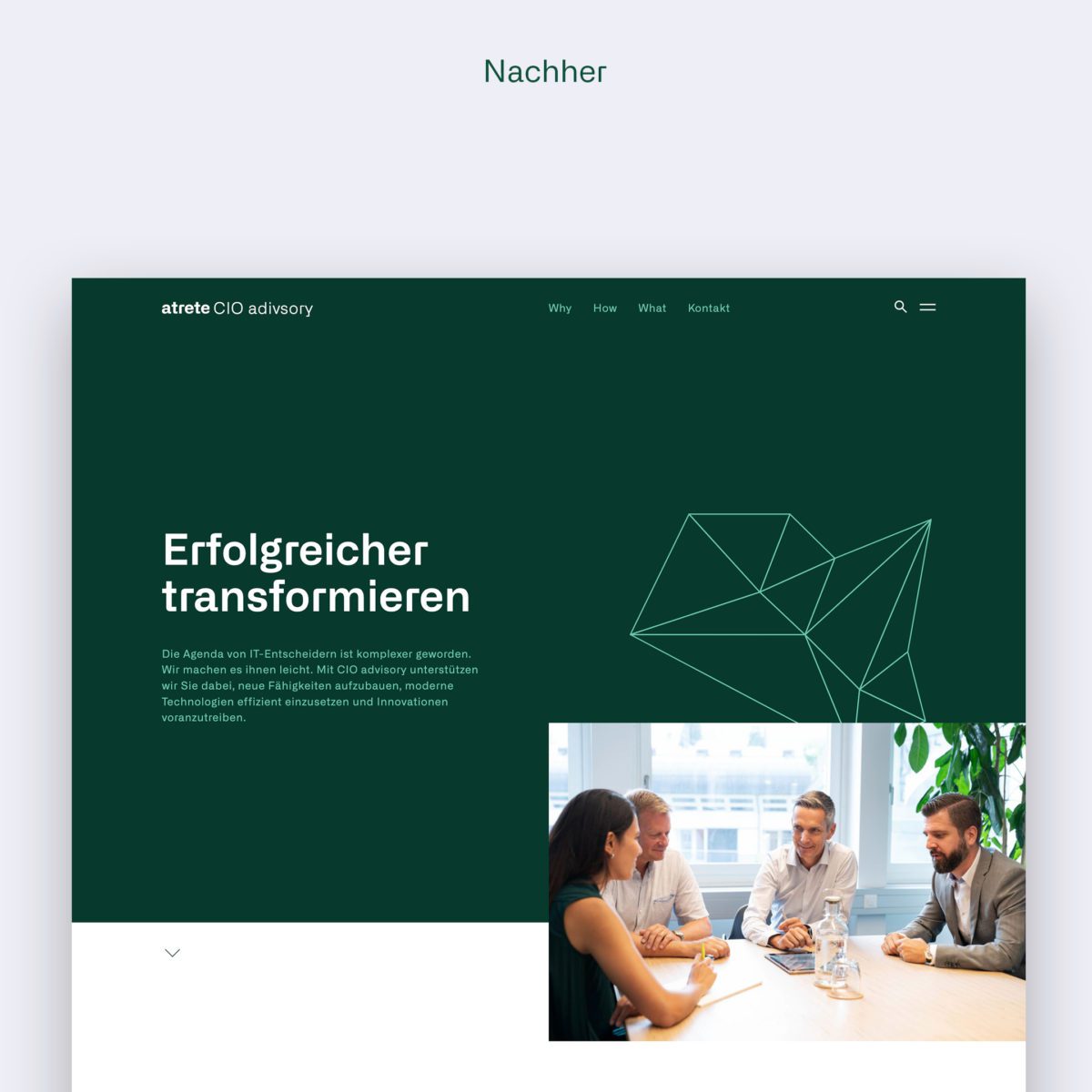
We created a new brand identity for the Swiss IT consultancy atrete. This marks the start of a new era for atrete, which has appropriately organised itself into agile practice areas.
Since 1997, atrete has been offering independent and neutral IT consulting. Renowned national and multinational clients rely on the consulting services of atrete consultants in the areas of CIO advisory, IT sourcing advisory, cyber security, digital workplace & collaboration, cloud and datacenter & connectivity.
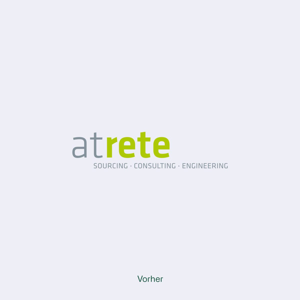
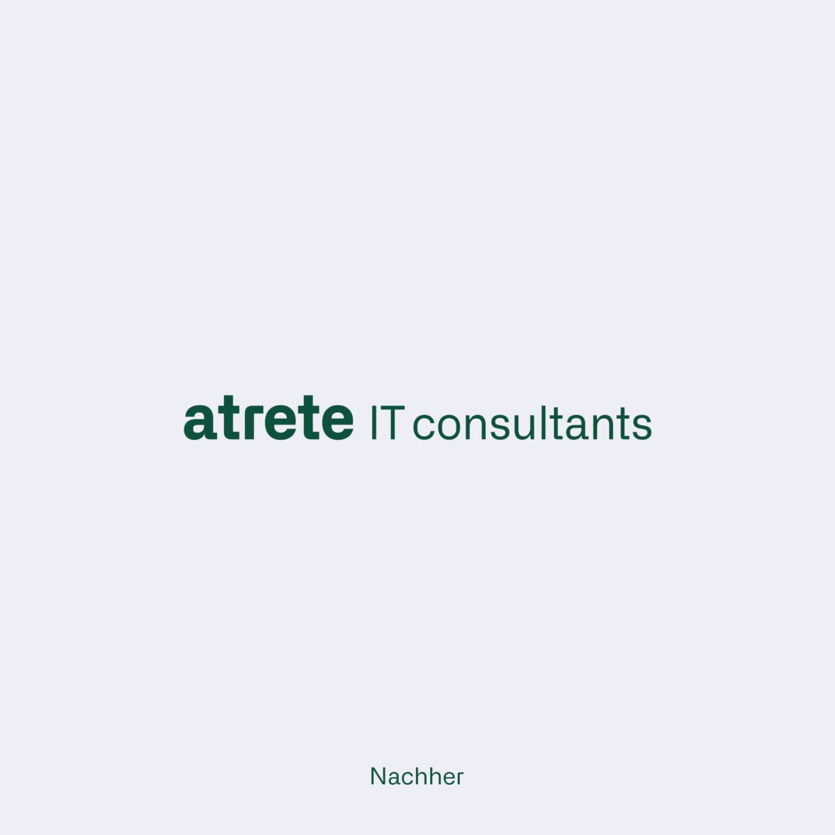
Rete, (lat.) the net - forms the core of the design concept. The demands on the consultancy firm have become more diverse, which we wanted to illustrate in the three-dimensional evolution of the net into an agile communication crystal. A pictorial symbol that is constantly moving and adapting symbolises the reorganisation of the practice areas and provides the company with a visual tool. The crystal can thus be used in its diversity in all communication media and guarantees the recognition of atrete.
